Making WSJ.com More Accessible
June 03, 2018
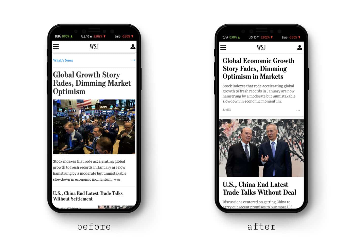
As I write this, the WSJ.com team is launching a brand new homepage experience for small screens.1 It’s one of our biggest subscription-drivers, a page that hundreds of thousands of people see every day. The new experience builds on the award-winning design of the WSJ iOS and Android apps. It’s curated specifically for mobile reading by an amazing editorial team.
It’s also our first step towards making WSJ.com more accessible to all of our users.
 The WSJ.com mobile homepage before and after the re-design
For many products — especially media platforms — accessibility is a bullet point on a QA checklist. I want to set a much higher bar for our products. Over the past 6 months, I’ve collaborated closely with designers, product managers, engineers, and journalists to focus on leading the media industry in accessibility standards. The new mobile homepage is proof of our team’s dedication to that mission.
As we continue our pursuit of accessibility across all of WSJ.com, I’d like to share the work we’ve done to get here.
Defining accessibility
Last November, I set out to write accessibility guidelines for the WSJ.com team. I wanted to tackle the hardest question first: what does accessibility mean? After lots of writing and editing, I had the following:
What is accessibility?
Accessibility is the word we use when describing a broad set of guidelines and principles that make our products easy to use.
Why is accessibility important?
Many of our members have visual, hearing, motor, or cognitive disabilities. It is our goal to provide the same value to them as any other member.
However, accessibility is for everybody. Here are some examples of situationaldisabilities:
- Visual: Reading a story outside in bright sunlight that makes it difficult to read small text
- Hearing: Watching a video in a loud place that makes it difficult to hear audio
- Motor: Wearing winter gloves that make it difficult to use a touchscreen accurately
- Cognitive: Listening to a podcast while cooking, making it difficult to pay attention
By adhering to and maintaining these principles and guidelines, we can make our products better for all our users.
Defining accessibility this way helps us understand just how vital it is to our products. You can read a public version of our guidelines here.
Partnering with engineering
Designing for accessibility is only one part of the process. Building accessible productsrequires a close collaboration between engineers and designers.
For example, many of our users navigate the site without a mouse. Instead, they use a keyboard, joystick, or sip and puff technology. To these users, focus states are vital — imagine using a mouse without an onscreen pointer! Our designers specified meaningful focus states for all elements (not just buttons), and engineering ensured focus states are always present2. During the build and QA phases, automated tests make sure we didn’t miss anything. Close collaboration allows us to build things the right way.
Advocating for accessibility
In addition to pursuing collaboration with engineering, it’s important to communicate the importance of accessibility to your stakeholders. These stakeholders can be leaders inside your company, groups of users, or valuable contributors outside the organization.
On the WSJ design team, we use design principles to communicate our values. At the time I’m writing this, two of our six principles address accessibility:
Enable Users
Everything that we design should enable users to access, connect with, and contribute to the content produced by The Wall Street Journal.
Design for Everybody
Apply accessibility and inclusivity principles at every step of the process. Design not only for the users we have today, but for the users we want to have in the future.
By publishing and sharing these principles, we help others see the value of accessibility in the same way we do.
The result
Our work has paid off. The previous mobile homepage scored an embarrassing 39 points on Google’s Lighthouse accessibility audit.
 Google Lighthouse accessibility audit on May 20th, 2018
At this moment, our new mobile homepage is at an 82 🎉 3
 Google Lighthouse accessibility audit on June 3rd, 2018
We still have some work to do on this page to push the score even higher. Getting a score of 100 isn’t our goal, however, and we’ll never be able to ace every metric of accessibility. Instead, as we continue on to other parts of WSJ.com, I’m keeping a simpler mission in mind: make our products easy to use for everybody.
Acknowledgements
Everything we do at The Wall Street Journal is a collaboration. I want to give a special thanks to Ryan Yun, who really made accessibility a priority in building this page. Many more people contributed, and continue to contribute, to this project and many others:
- Delia, product manager for WSJ.com’s core curation products
- Our WSJ.com frontend team - Vishaal, Morgan, Vasudha, Adam, Christian, Surya, Doug, and Tania
- The mobile team, including Jason, Mike, Janit, Amit, and Jordan.
- Our editorial partners - Jenn, Lydia, and Meg
- My design leadership peers, Bonnie, Thomas, and Fernando
- The SEO and Revenue team - Rich, Chris, Gio, Johnny, Lee, Bhupendra, Marcin, Dominique, Anna, and Marish
- Our product leadership, Katharine, Rajiv, and Che
- Update: we’re live! Visit https://wsj.com on your phone to see the result of our hard work. ↩
- My advice is to simply leave default focus states intact as much as possible. Here’s some more advice from the a11y project. ↩
- With a product as dynamic as WSJ.com, our accessibility scores fluctuate constantly. One of the biggest challenges we face is maintaining a high standard, regardless of our ever-evolving editorial and advertising strategies. ↩
Source: Matthew Strom

