Open Source Software That Helps Make Museum Websites More Accessible
April 19, 2019
Earlier this year, dozens of New York City art galleries were hit with lawsuits filed separately by two legally blind plaintiffs. Their common charge: The websites of galleries including Sperone Westwater, Gagosian, and David Zwirner were not readable by people with vision loss, an alleged violation of the Americans with Disabilities Act (ADA).
Many of these cases are pending, and the law on ADA website compliance is murky. But defendants and other cultural players who do want to break down digital barriers face the question of how they can redesign their websites to be accessible to all. One particular issue: how to provide clear information about images of artwork. For this, galleries and museums can look to the Museum of Contemporary Art (MCA) in Chicago, which has created a tool that seamlessly integrates image descriptions into its online platform.
Called Coyote, this program provides a system for creating, reviewing, and managing the language used to describe art—a thorny process that involves acknowledging and navigating personal prejudices. Its name refers to a Hopi legend about a coyote that wanted to see further than its own eyes would allow.
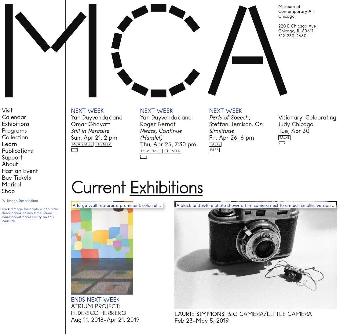
Details of the MCA's homepage showcasing Coyote image descriptions. © MCA Chicago.
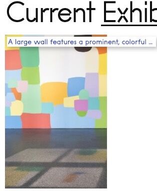
Visit the MCA’s website, toggle on the descriptions by clicking “image description” in the menu on the left, and small white boxes with blue text appear atop images. The caption for Laurie Simmons
’s Walking House(1989), used to promote the MCA’s ongoing survey of her work, reads: “A black-and-white photograph depicts a model house sitting atop naked, feminine legs wearing nude heels.” A work by Doris Salcedo
is described as: “Four murky sepia-toned images of shoes embedded on a white wall by what appears to be surgical stitching.” These descriptions can automatically be transcribed aloud by screen readers, allowing visually impaired or blind users to imagine the artwork.
Many museums ensure that individuals with disabilities can experience art in person by providing special resources, from in-gallery audio descriptions to tactile tours. But most can benefit from improving accessibility for their virtual visitors. The MCA Chicago’s website is the first by a museum that has “intentionally created visual descriptions as a primary feature,” according to Sina Bahram, founder of Prime Access Consulting, a company that helps organizations make their digital spaces more accessible. “There are museum websites that put alt text on images”—HTML code descriptions that screen readers can detect—“but to our knowledge, this is the first to take image descriptions so seriously and surface them for all users.”
The result is a laudable example of inclusive design—a design approach that ensures products have equitable use for people with diverse abilities. In other words, the same information is conveyed to everyone, no matter their visual acuity.
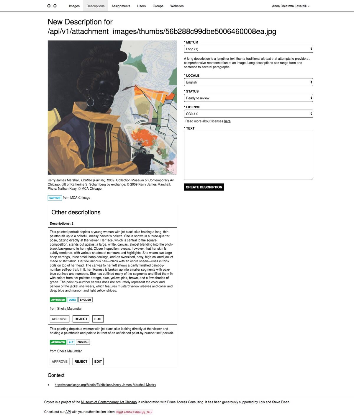
Long and short description of Kerry James Marshall’s Untitled (Painter), 2009 in the MCA’s image description software, Coyote. © MCA Chicago.
Bahram was hired by the museum in 2015, when it was redesigning its website, and he spearheaded the project alongside former MCA employees Susan Chun and Anna Chiaretta Lavatelli. That year also marked the 25th anniversary of the passage of the ADA, and the MCA had been in conversations with other museums across the country about how to better serve visitors with disabilities. “We wanted to build a platform to solve a need for institutions to enhance access for visitors who are blind and visually impaired,” said Lisa Key, MCA Chicago’s deputy director. “It was clear that we needed better tools.”
Coyote is a free, open-source software that lives in the cloud, so anyone can adopt it. Editors log in and write descriptions for images assigned to them, which get reviewed before web developers present them to the public. “Think of it like a Google Doc for image descriptions,” Bahram said. “There’s an editing and approval flow that is really critical.”
Currently, just about 10 percent of the MCA’s 20,000 or so images have descriptions, but the museum’s editorial team has devoted a lot of energy to coming up with guidelines for writing about artworks in the most effective and intelligible way. The quandaries are complicated: What kind of visual information do you include in a few succinct lines? How does diction help shape the experience of learning about an artwork? How do you clearly describe abstract art?
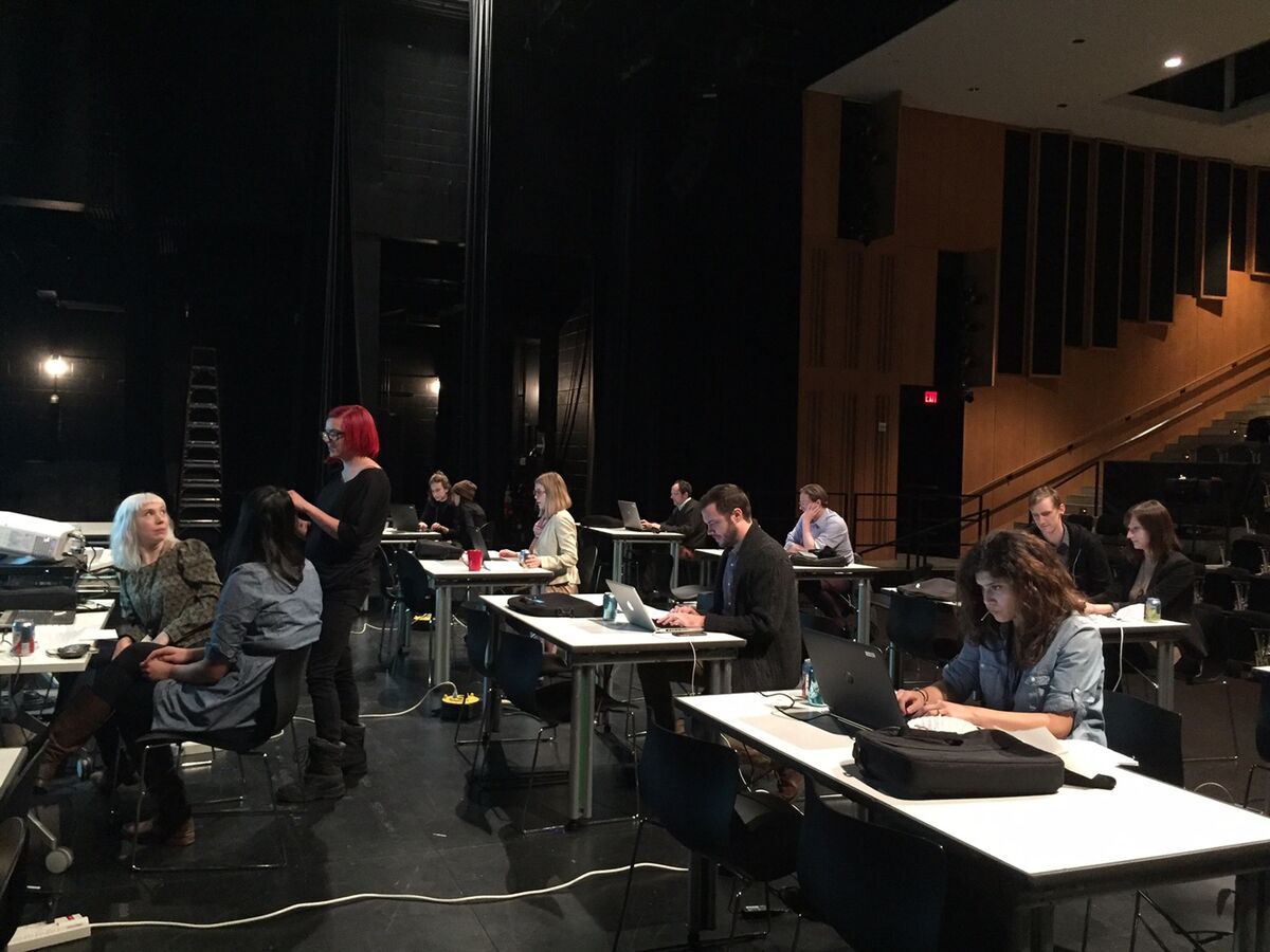
MCA staff gather on the stage to write Coyote descriptions. Photo © MCA Chicago.
“Our primary goals are to be accurate, informative, and to stay within [30 words],” said Sheila Majumdar, the museum’s senior editor. “The biggest challenge lies in guarding against internal biases and mistaking opinion or assumption for fact. This is why every description is reviewed by an editor, and no editors approve their own descriptions.”
The Coyote team developed a style guide (also freely accessible online) to help them decide what to include or exclude in descriptions. There are tips related to focus (“describe the objects/information most important to understanding the image”), demographic information (“default to ‘light-skinned’ and ‘dark-skinned,’ when clearly visible”); and precision (“avoid excessive specificity and jargon”). “The first question I recommend asking is, ‘What is relevant?’” said Majumdar. “There is a lot of room for interpretation. In some instances, colors, shapes, or textures might take precedence over narrative content.”
The MCA’s team is also aiming to write two descriptions for every image—a short one and a long one. Screen readers automatically read the former; the latter, which requires users to opt in, gives a more detailed and evocative understanding of an image. The aforementioned Simmons photograph, for instance, has a longer description that reads: “The humanoid house is dramatically lit against a black background, as if posing for a portrait or performing in a play. The house is angled downward toward the floor, giving an impression of sheepishness or a bowing movement.” And the MCA doesn’t only describe images of artworks; it also provides captions for promotional photography and performance documentation. Faced with a massive and growing image repository, editors are now prioritizing images related to current exhibitions and programs, while working backward to fill in text for images of artworks in its permanent collection.
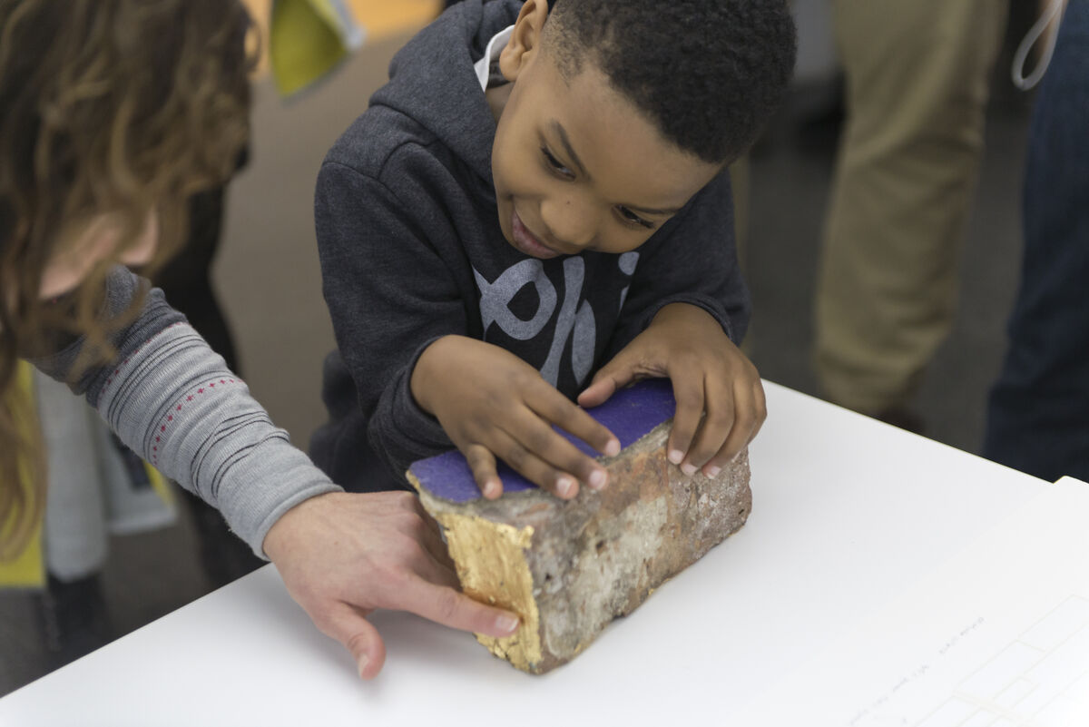
Photo from MCA’s Touch Tour of Chicago Works: Amanda Williams, 2017. Photo by Nathan Keay. © MCA Chicago
A web designer might shudder at the thought of all this additional text. But the notion that it is difficult to produce a website that is both accessible and elegant is “a false narrative that we fight against,” Bahram said. “That these two things are antithetical is simply not true. It’s not only the right thing to do, but it is easy to achieve those things.”
Of course, revamping your website to meet accessibility standards requires resources, and image descriptions are a very small part of this process, which involves considering details like color contrast and the number of flashing objects on a page. Museums and other cultural spaces interested in using Coyote have to consider the labor required of their web and content developers. But the software can be customized, even for small businesses. “We want to work with people to encourage them to make their websites more inclusive, as far as image descriptions,” Bahram said. “We want to make sure we have the right solution for them. We’re solving a need, not a want.”
Coyote is just one program the MCA has implemented to enhance the museum experience for its visitors with disabilities, in addition to its American Sign Language and touch tours. Last month, it started offering free admission to members of this community and their companions. “By removing any financial barrier, we really want to encourage them to visit,” said Key. The museum’s commitment to Coyote extends that sentiment to its digital gateway—often the first impression visitors have of an institution they plan to visit.
Chicagoan Patti Gregory-Chang, treasurer for the National Federation of the Blind of Illinois, was excited when she found out about the museum’s website and in-gallery programs earlier this week. “This might make me go back to museums,” she said. “Too often our experience is finding glass with nothing we can touch and no audio we can hear. Museums should be for everyone.
Source: Artsy

