The HAWRAF Design Platform Allows Designing and Reading Books with Accessibility Features
October 04, 2017
Books in their current form are thousands of years old, dating back to the Roman Empire. And even today’s e-books preserve the visual cues of their traditional analog counterparts, with tables of contents, page numbers, and the affordance of “turning the page” by swiping. Reading in your browser, however, has retained little of the charm of reading a book, digital or real.
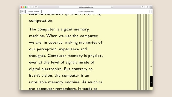
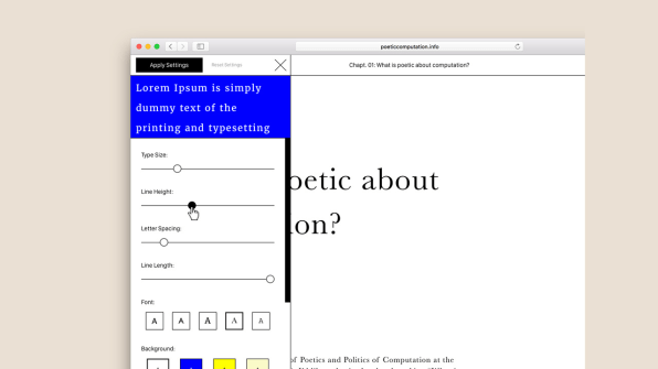
Now, the New York-based design studio HAWRAF is bringing some of those visual cues to a new digital book platform. In essence, it’s a browser-based e-book. Designed specifically for a new online book called Poetic Computation: Reader by Taeyoon Choi, the platform lets users play around with font, text size, line spacing, and background color. When you click on the footnotes, located in tiny typography to the right of the main text, they overtake the main text so you can get a closer look. Meanwhile, anything you highlight can be exported as a PDF, letting you turn the most relevant parts of the book into a printable file. A “focus mode” blacks out most of the browser, keeping your wandering eyes from getting distracted. It’s the best aspects of reading online, combined with those of an actual book.
 [Image: courtesy HAWRAF]
In Reader, Choi, who cofounded the New York-based School for Poetic Computation in 2013, has distilled the lectures from one of his classes that’s designed to help students think artistically and critically about technology. Choi loves paper books, but he isn’t trying to get his Reader into print. Instead, he wanted to tie the content of the book to the method through which it was published. “
>span class="s2">Besides giving users the freedom to play around with font and spacing, HAWRAF’s design also makes Reader significantly more accessible–most pointedly with the dyslexic mode, which lays out the book in a font more easily read by those with dyslexia, and the text-to-speech mode, which is for visually impaired users and for anyone who might prefer to listen rather than read.
 [Image: courtesy HAWRAF]
The key is that the platform never assumes that one particular format is the optimal one–and it takes advantage of all the internet’s capabilities to provide choice. “I think it’s really empowering for the reader to be able to have that decision,” Choi says.
The team is now working on making the underlying code that runs Readeropen source. Allowing anyone to use it is their ultimate ambition. Some of the ideas, particularly those around accessibility, would be welcome additions to any text-heavy website. How many more articles would you be able to get through if you could black out all your browser’s distractions? Andrew Herzog, one of the partners at HAWRAF, imagines a “reader” platform in the future that you could use to consume all your content, or an academic tool that would let people put the main text of a book and the footnotes side by side.
The online book does retain some semblance of its physical manifestation, too, with a set of lines on the right side of the browser that vaguely resemble pages. Mousing over them reveals a navigation bar that lets you flip to any chapter–one of the best parts of a physical book, and one that’s hard to replicate with a digital book. When you get to the end of a section, the page gracefully shifts to the left, retaining an echo of the page flip. It’s proof that even in 2017, books can find a new form.
Source: Co Design